A new way of booking air travel
Airline travel is a massive industry with multiple airlines vying for user attention (and fares). However, the vast majority of airline websites and apps are sorely lacking in good user experiences. Startup airline True Fly aims to use great design and a user centric approach to gain advantage over larger, established airlines.
New airline True Fly requires a website and mobile app. The goal is to gain market share through utiilising a user centric approach and dispensing with the frustrations users frequently experience on airline sites.
The project focuses primarily on the airline booking procedure and endeavours to identify key weaknesses and frustrations encountered by users in the process and remedy these.
The method by which users search for, find, book and pay for flights will be investigated and documented. Utilising this research and analysis, a working protoype - along with an accompanying set of wireframes - will be designed and developed.
Will future airline travelers have a good user experience?
My role in this project is UX Designer. I completed all activites in the UX project cycle in a solo capacity - from research to design to prototyping. This has resulted in the accumulation of a huge amount of knowledge and many new skills such as;
Airline users are a very broad demographic. This makes the project somewhat more challenging as there is not a clearly defined target audience. Accessibility and ease of use is clearly of the utmost consideration throughout the project cycle to cater for a wide range of abilities and profiles.
A user survey was devised and circulated to a wide range of participants. The purpose of the survey was to learn more about the goals of people who use airline websites and apps. 29 responses were received with many offering valuable insights into the mindset of the airline user. Some interesting patterns that emerged are noted below:
A recruitment screener was devised to select appropriate users for the usability tests and interviews. Requirements included the booking of a flight in the three months prior to the tests and using the internet on a regular basis.
The usability tests consisted of comparative studies of airline websites and apps. The research objective was to learn about the goals, behaviours and context of airline customers when booking flights.
This (airline) actually recognises that customers are human.
User interviews were also completed with the objective of learning more about the context of use of people that use airline websites and apps.
I check in online, sit wherever there's a seat and take minimal baggage.
In-depth analysis of four well regarded competitor sites and apps revealed a wealth of information about best practices and unearthed some unexpected discrepancies also. This analysis will prove invaluable at the design stage of the process.
The results of this research were intriguing. Every user - even the most tech savvy, well travelled of them - encountered frustrations and obstacles during the booking process.
Why do they think they are difference from any other e-commerce website? (The process) shouldn't be any different from buying a jumper.
All of the user research was analysed and documented in detail. This material will serve as a constant reference point throughout the remainder of the project and inform all phases of the design stage.
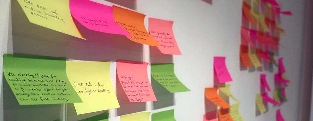
On completion of the initial user research phase, the results were assimilated and used to create an affinity diagram.
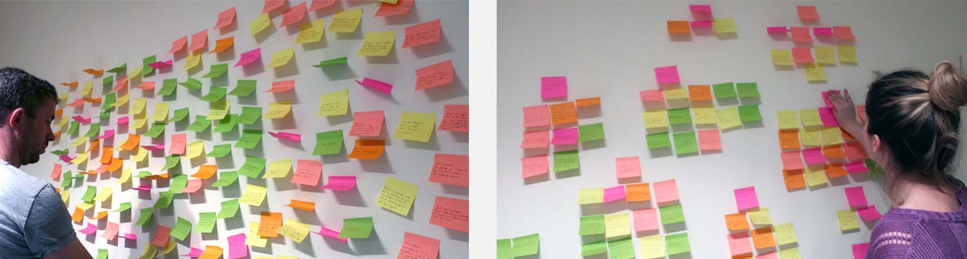
Post-its were used to highlight user insights and then organised into categories, detailing particular pain points and user insights. The results are detailed in the "Defining the Problem" section.
Further analysis of the user research results allowed for the development of a user journey map.
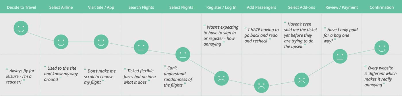
User journey map (not shown: detailed points regarding goals, behaviours, context and pain points)
The above diagram highlights the users emotions at various stages of the process. It is clear that sections that require customer input are unsatisfactory.
It should say whether seat selection is mandatory or not.
The affinity diagram and user journey map led to the identification of clear primary pain points in the user airline booking journey:
Concerned I haven't booked what I think I've booked.
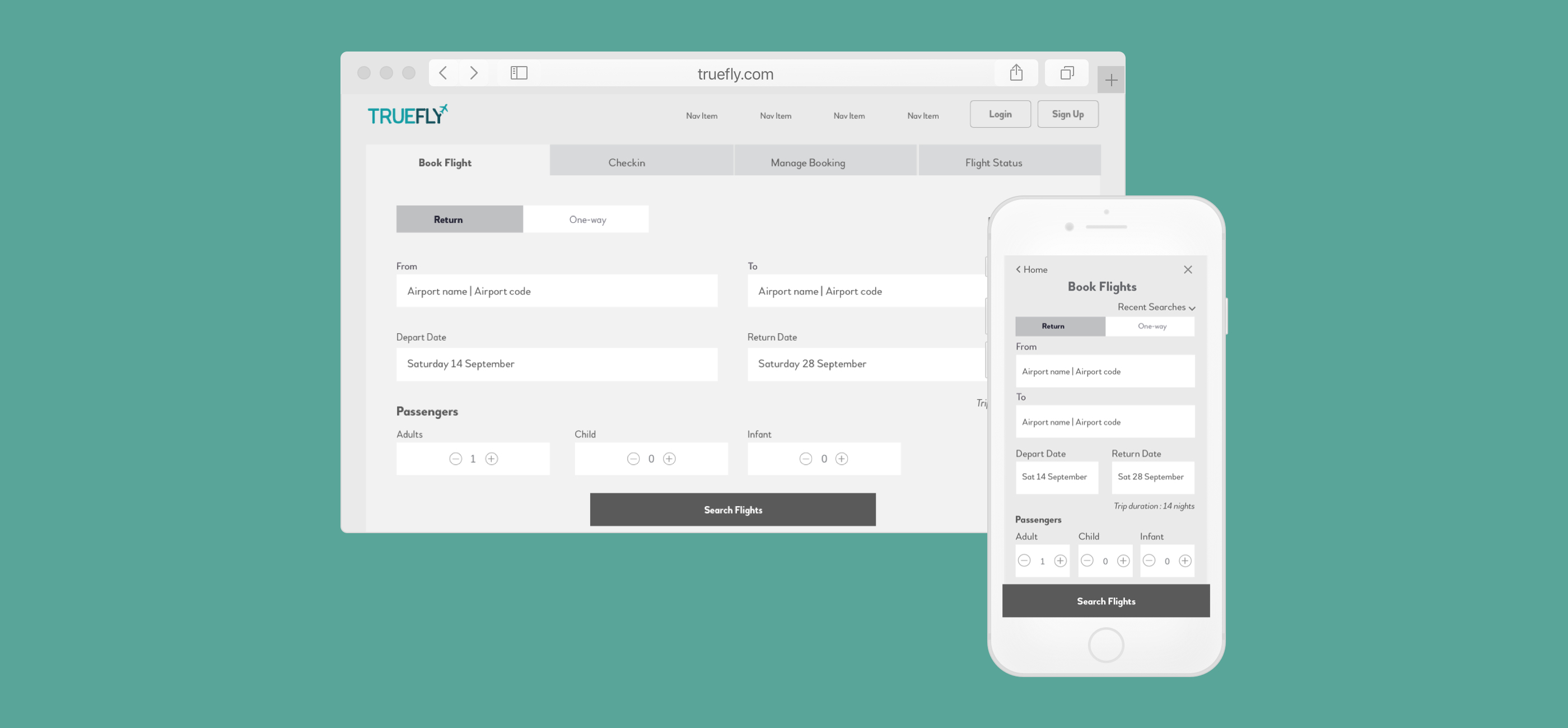
Detailed flow diagrams were created to illustrate the primary user flow (and potential secondary paths) through both the desktop website and mobile app booking processes - from the moment they enter the website to the end point of the booking process when payment has been confirmed.
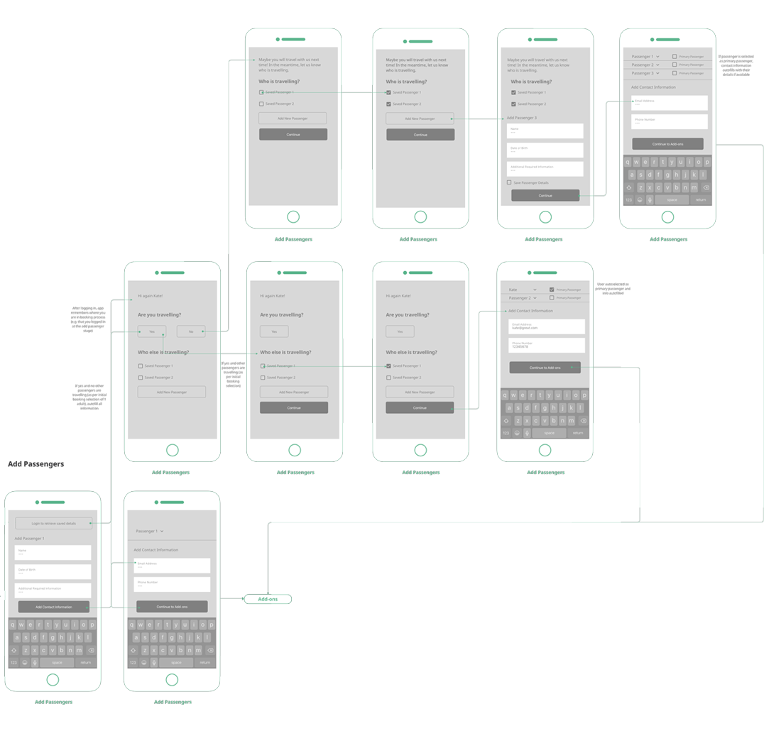
"Add Passengers" section from the mobile user flow diagram
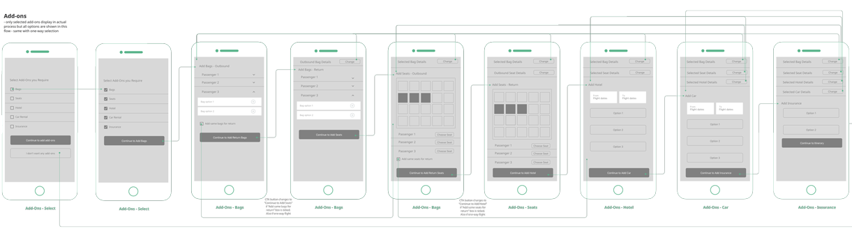
"Choose Add-ons" section from the mobile user flow diagram
The above sections demonstrate the user flow through the passenger and add-on sections of the booking process. These have specifically been shown as they differ a little from the typical booking process flow. The "add passenger" has a conversation with the (logged in) user and asks a few direct questions to establish who is travelling. Traveller details and contact details are autofilled based on the results of this conversation. The "add-ons" section puts the user in control. Rather than forcing users through all the add-on options to get to the payment point, again, a conversation is initiated asking the user which add-ons they want - if any.
Based on the user flow diagrams - and bearing the main pain points in mind - sketches of the mobile and desktop layouts were developed. These sketches included consideration of the primary user flow, positioning of main navigation and how interactions on both versions would work.
After many iterations, the rough basis for developing a medium fidelity prototype was achieved and a prototype was created using InVision.
Medium fidelity protoype for the mobile app. Click the screen to interact.
The above prototypes are the end point of this project. Detailed wireframes were also created to communicate with the (fictional) development team on how all aspects of the prototype behave e.g. control rules, feedback messages and so on. The main issues - as identified during the user research phase - and their solutions that have been addressed in the above prototype, are listed below.
An identity was developed for the True Fly brand. Clean and modern, it is instantly reconisable and scaleable. A colour palette with warm, reassuring undertones was also assembled for use across all applications.
![]()
Identity and colour palette for the True Fly airline